As I spoke about before, the girls are starting their own bakery. They decided that they needed a logo as cool as the current farm logo. ![]()
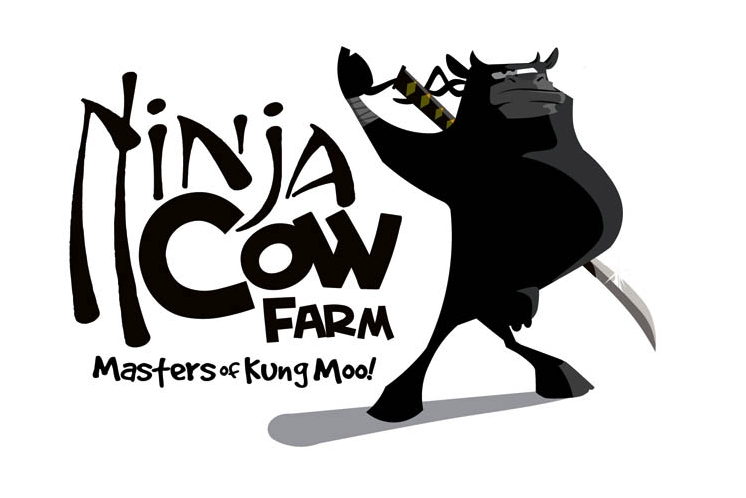
We’d gone to 99designs.com to get the farm logo done and couldn’t have been happier with it. It’s unique, edgy, and fun. It’s certainly better than anything we could come up with on our own. With this logo as our example, we set out to design a new logo. After some pre-work, we submitted 4 logo designs to everyone to get their input. Very quickly one design rose to the top.
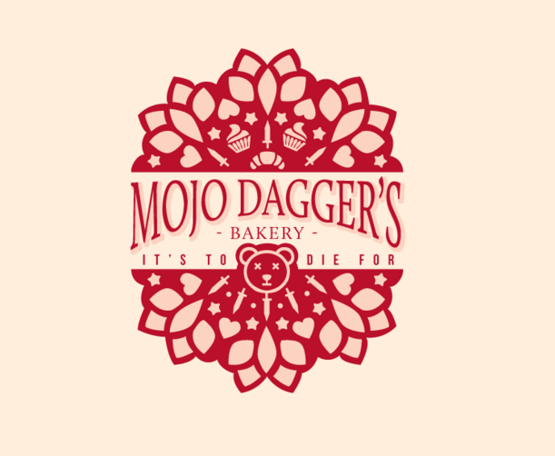
This was the only logo that actually matched what I’d requested in my contest write up. I wanted something that looked frilly and girly at first. If you didn’t look twice you’d not even notice anything unusual about it. But our girls aren’t usual, they are farm girls. So if you look closer, you see daggers and the teddy bear has x’d out eyes. It didn’t have as much detail as I’d have liked but it was an early draft. However there was a problem. The girls didn’t want me to run a contest. They’d already picked their favorite.
It was this one.
To top it off, SWMBO really loved this one as well. It’s definitely edgy, it’s also fun like the farm logo. Plus we can cut out the cupcake skull and use the words as a text only logo.
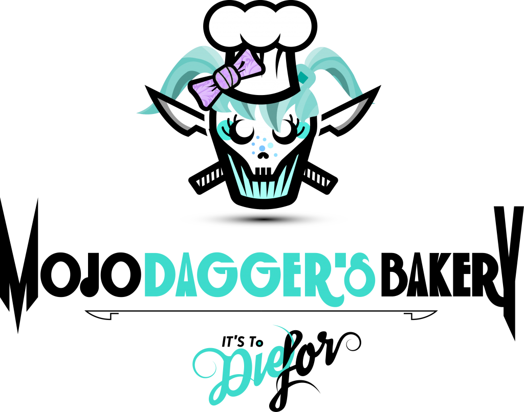
This logo was very polarizing, kind of like Donald Trump. It seemed that everyone either LOVED it or HATED it. Most troubling, some of our closest friends were the ones who hated it. But, some of our closest friends loved it. What to do? Despite the multiple one star votes, it was a close second place to the first logo. What to do?
While I was on 99designs, I went back to look at the last poll we’d run for our farm logo design contest. I remembered we’d picked the 2nd place choice back then but couldn’t recall what first place was.
This logo looks flat and lifeless compared to the one we have now. It was about 25% of the cost to set up to print which had its advantages but the pain of that cost is long gone and my farm t-shirts, license plates, door panels, etc. all look great to me now. At the time, this one was my favorite and SWMBO voted strongly for the one we eventually picked. Now I can’t imagine having this one as our logo. So what to do? As any smart man would, I went with what the girls wanted.
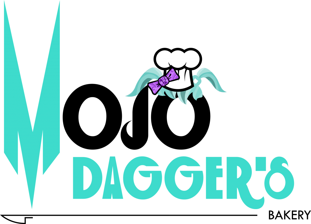
We also got included a text heavy version of the logo for our use. The designer bent over backwards to make sure we were happy with our final product, even calling us multiple times after he’d won just to make sure we had everything. I think after this logo settles in, we’ll wonder why we ever looked at the other ones.
Now, to order some shirts.